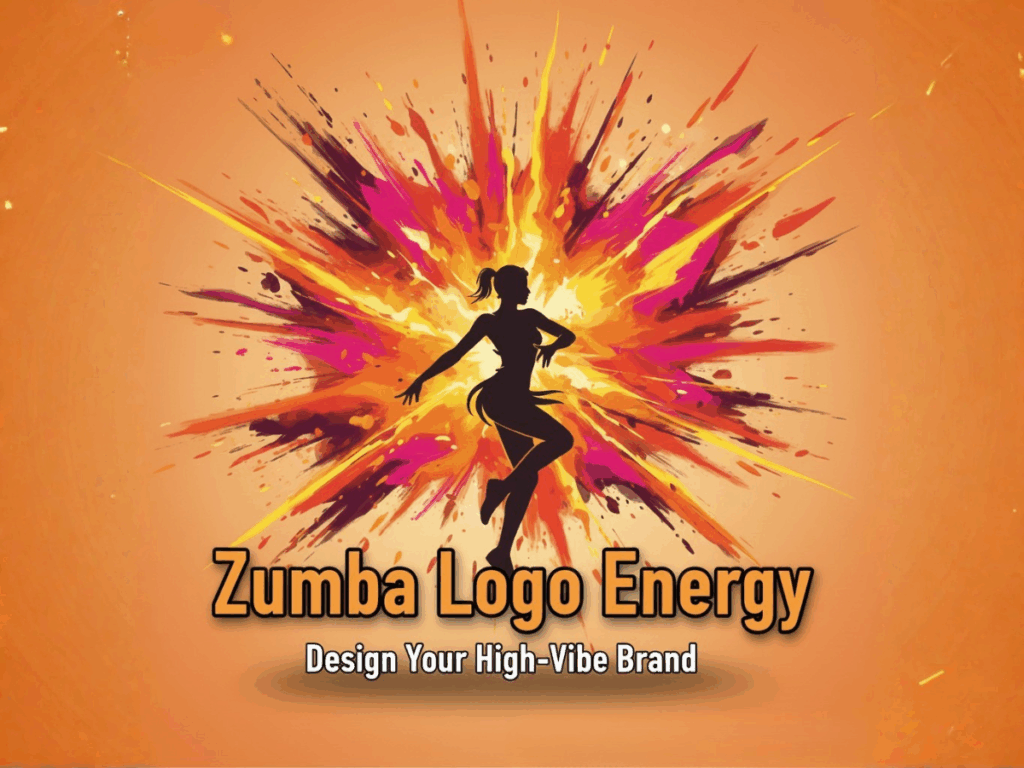
Zumba Logo Design:How to Create a High-Energy Fitness Brand Logo
Contents
Introduction
Launching a fitness studio or activewear line requires a memorable brand identity. Your logo is the visual shortcut to that energy, and at Logogenerator, we understand its critical importance in a crowded market. We will analyze the globally recognized Zumba logo's success to show you how to design a mark that captures movement, fun, and vitality for your own brand.
The Importance of a Logo in Fitness
In the high-octane world of fitness, your logo does heavy lifting:
● First Impression: Your logo is often the very first thing a potential client sees—on a studio sign, a website, or a piece of Zumba fitness clothes. It needs to instantly convey what you are all about.
● Trust and Professionalism:A well-designed logo creates an image of professionalism and reliability, essential for attracting long-term members.
● Differentiation: Without a unique visual mark, your business risks blending into the sea of generic gyms and studios. A strong design, much like the dynamic Zumba logo, ensures instant recognition.
Understanding the High-Energy Fitness Brand
Before jumping into design, you must define your brand's core essence, drawing inspiration from industry giants.
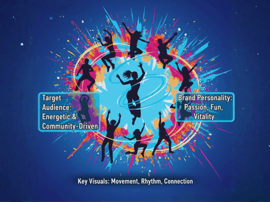
Target Audience & Brand Personality
Who exactly is your audience, and how should your brand make them feel?
● Target Audience: The typical fitness or dance audience is looking for motivation, community, and often, fun. Unlike bodybuilding or powerlifting, brands inspired by the Zumba logo target a broad group seeking enjoyment through movement.
● Brand Personality: The required feeling is typically excitement, passion, inclusion, and dynamism. The entire Zumba logo concept is built on radiating Latin-inspired energy and joy. Your logo should be an immediate motivator.
Key Visual Elements & Imagery
The best fitness logos use visual elements that immediately suggest activity:
● Movement & Flow: Swirls, curved lines, and abstract shapes that imply motion or a dancing figure.
● Energy Sources: Stylized suns, sparks, or rhythmic wave patterns.
● Industry Tools: Silhouettes of figures dancing, weights, heartbeats, or studio-specific items.
The iconic figure element in the Zumba logo is a masterclass in using abstract movement to define a brand.
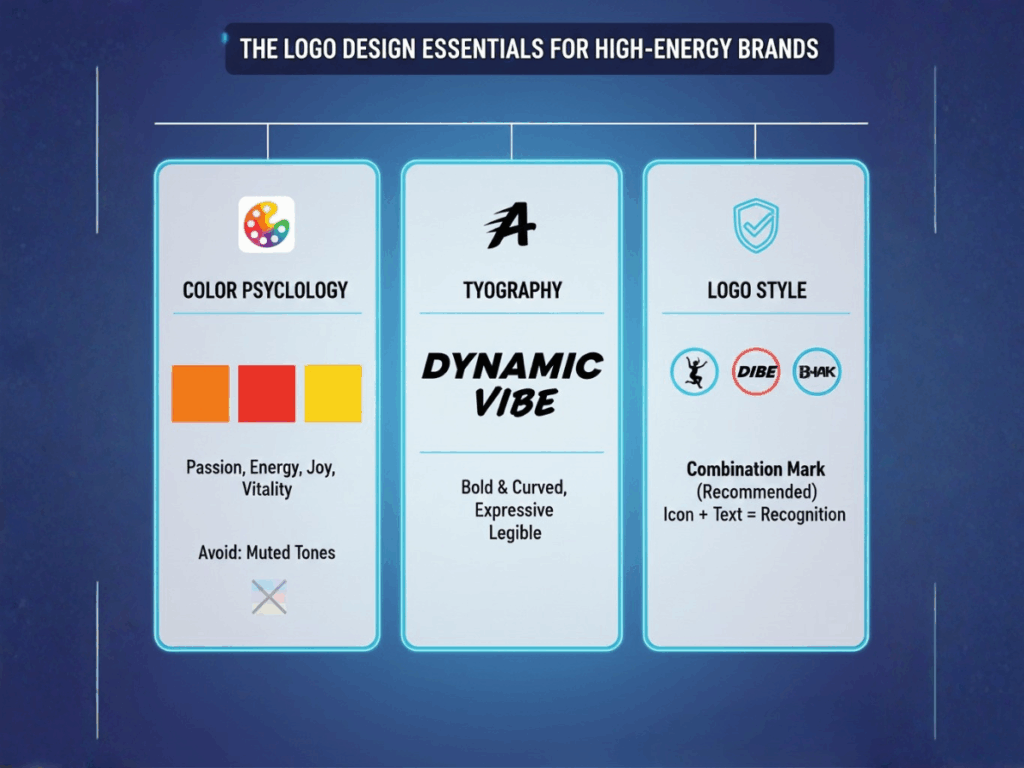
The Logo Design Essentials for High-Energy Brands
Color Psychology: Choosing the Right Palette
Colors are perhaps the most crucial element in conveying high energy, a lesson perfectly executed by the Zumba logo.
● Primary Industry Colors:
○ Vibrant Reds/Oranges/Yellows: Use bright, saturated versions of these colors. These warm colors evoke passion, high energy, enthusiasm, and joy. The official Zumba logo leverages these hues to transmit its lively, party-like atmosphere.
○ Electric Blues/Teal: Suggests endurance, stamina, and confidence. Excellent as a secondary or accent color.
○ Lime Green: Often associated with vitality, health, and freshness.
● Colors to Avoid: Muted tones (grays, pastels) can appear too calm or serious for a high-energy dance brand. Black can be used for contrast but should not dominate the design, as it might dampen the required feeling of spontaneous fun conveyed by the Zumba logo's palette.
Typography: Fonts That Speak to the Brand
The font you choose gives your logo its voice. For fitness logo design in the dance/high-impact space, legibility is essential, but personality is key.
● Font Style Recommendations: Bold & Curved Sans-Serif
The best choice for energy. Fonts should be thick enough to convey strength, yet have slightly rounded or curved edges to suggest motion, not rigidity. Think about the bouncy, dynamic letters used in the original Zumba logo.
● Fonts to Avoid: Avoid thin, delicate script fonts (too fragile) or overly rigid, blocky serifs (too corporate and static).
Logo Style: Icon vs. Wordmark vs. Combination
Which format works best for your fitness logo design?
● Combination Marks (Icon + Text): This style, used by the Zumba logo, is overwhelmingly the best choice for this industry. The icon provides immediate, emotional recognition (the dancing figure), while the wordmark provides brand name clarity. This is essential for new studios or a new line of Zumba fitness clothes trying to build a reputation.
● Wordmarks: Suitable if your brand name is short, punchy, and highly unique (e.g., "PULSE" or "BLAST").
● Icon Marks: Only effective once your brand, like the Zumba logo, is globally famous and instantly recognizable without the text.
Create Zumba Logo in Minutes
Finally, just one simple step —— click the button to generate your perfect logo!
Conclusion
The Zumba logo proves that a successful logo is a feeling, capturing high-energy and community essence. Apply its blueprint—dynamic color and movement-focused design—to your brand. Don't let design challenges hinder your passion. Your brand deserves that vibrant, professional face. Ready to create a logo with the infectious energy of the Zumba logo? Stop dreaming and start designing!